
Application
Individual iron-on letters look like the easy option and they are the fiddliest thing in this trade. The adhesive behaves exactly as it does on a patch. What makes letters hard is that a word has to sit straight, and there are six or eight chances to get that wrong instead of one.
Short answer. Lay the whole word out and mark a baseline before any heat touches the garment. Align the letters on that line, not by the tops of the tiles. Press the middle letters first and work outwards. Then stitch them, because letters lift even faster than patches do.
Align to the baseline, not the tops
This is the mistake that makes home-done lettering look home-done, and it is entirely avoidable. Letters are cut to their own shapes, so the tiles are different heights: a lower-case g has a tail, an a does not, a capital R is taller than both. Line the tiles up by their top edges and every letter with a descender rides high.
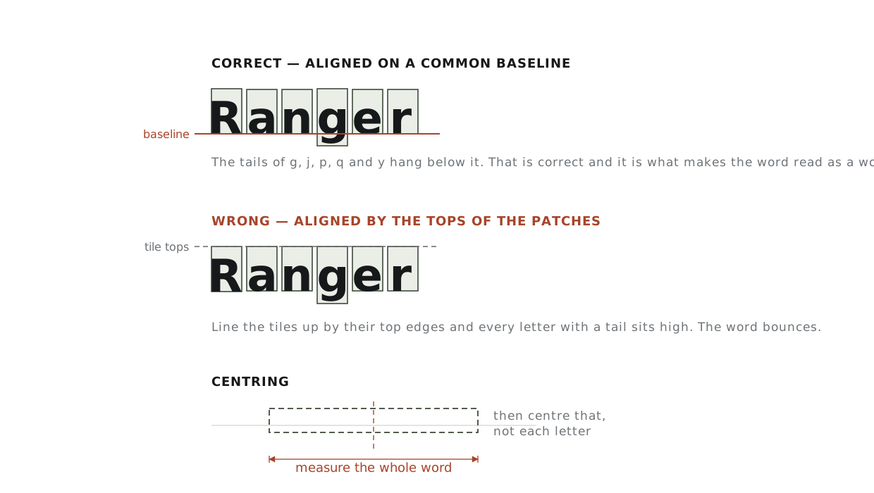
- Draw a light baseline on the garment with tailor’s chalk or a water-soluble pen. A long ruler and a straight seam to measure from beats eyeballing it every time.
- Sit each letter on that line. Descenders — g, j, p, q, y — cross it and hang below. That is correct.
- Capitals and most lower-case letters sit on it exactly. Round letters like o, e and c may extend a hair below; that is how type works and it is invisible at a glance.
Spacing
Even gaps between the tiles do not produce even-looking spacing, because the letters inside them are different widths. What the eye reads is the area of white between the letter shapes, not the distance between their boxes.
- Set the gap by eye between the letter shapes, not the tile edges. A capital A next to a capital V needs less gap than two capital H’s.
- If you are aligning by measurement, start with an even tile gap and then close up the pairs that look loose — usually anything next to A, V, W, T, Y or a full stop.
- Squint at it. Blurring the word is the oldest trick in typesetting and it shows spacing problems immediately.
Centring
Centre the whole word, not the middle letter. Lay everything out, measure from the outside edge of the first letter to the outside edge of the last, halve it, and align that midpoint to your centre line. A word with an odd number of letters does not centre on its middle letter unless every letter happens to be the same width, which they never are.
For placement on the garment itself — how far below a collar seam, how far across from centre front — see how placement is measured.
Pressing them
- Turn steam off and empty the reservoir, then pre-press the area dry.
- Position every letter and check the whole word before applying any heat. Once a letter is tacked it is hard to move without marking the fabric.
- Tack the letters lightly first — a couple of seconds each — working from the middle of the word outwards. Starting at one end lets small errors accumulate along the line.
- Step back and read the word before you commit. This is the last easy moment.
- Press properly, one letter at a time, with a cover cloth and firm downward pressure. Do not slide.
- Turn the garment inside out and press again from the back.
- Let it cool completely before moving it.
Follow the temperature and dwell time on the letters’ own instruction sheet. Letter transfers use a range of different adhesives and films, and a figure that works for one brand will underheat or glaze another.
Why letters lift sooner than patches
A letter has a bad ratio. Its perimeter is long relative to its area — think of the inside of an e or the two legs of an R — and the edge is where heat-seal film fails first. A patch has one edge to protect. A six-letter word has dozens, several of them tiny.
Which is why the honest advice for letters is the same as for patches, only more so: heat positions them and thread keeps them. Stitch round each letter just inside its edge, in a matching thread. It is slow and it is the difference between a name that lasts a season and one that lasts the garment.
If the wording is fixed and you want it to last, a single embroidered name patch outlasts individual letters by a wide margin.
Fabric first, as always
Letters carry the same fabric restrictions as any heat-seal product. Cotton and cotton-rich wovens are fine. Nylon, polyester shells, waterproofs, fleece, leather and stretch knits are not — see which fabrics can take an iron-on patch for the full list and what to do instead.
Common problems
| Problem | Cause | Fix |
|---|---|---|
| The word looks like it is bouncing | Aligned by tile tops rather than a baseline | Remove and redo. There is no fixing it in place |
| Gaps look uneven despite equal measurement | Spacing set by tiles, not letter shapes | Close up the pairs beside A, V, W, T and Y |
| A letter lifted at a corner after one wash | Not enough dwell time at the edges, or no stitching | Stitch it. Re-pressing buys weeks, not years |
| Letters shifted while pressing | The iron was slid rather than pressed | Always lift and place. Never drag across tacked letters |
| Shiny marks around the letters | Direct iron contact with the fabric | Always use a cover cloth. On synthetics this is permanent |
Related: how to apply a patch covers the four attachment methods, and patch sizes covers the minimum letter height embroidery can hold, which is the same question from the other direction.
Common questions
How do I keep iron-on letters straight?
Mark a baseline on the garment before any heat touches it, and sit every letter on that line rather than on the tops of the tiles. The tiles are cut to different heights, so aligning by their top edges makes every letter with a descender ride high.
Should every letter sit exactly on the line?
Capitals and most lower-case letters sit on it exactly. Descenders — g, j, p, q, y — cross it and hang below, which is correct. Round letters like o, e and c may extend a hair below, and that is invisible at a glance.
How do I space the letters evenly?
Set the gap by eye between the letter shapes, not the tile edges, because what the eye reads is the area of white between the shapes rather than the distance between their boxes. A capital A next to a capital V needs less gap than two capital H’s. Squinting at the word shows spacing problems immediately.
How do I centre a word?
Centre the whole word, not the middle letter. Lay everything out and measure from the outside edges.
Do iron-on letters last?
Not on their own — letters lift even faster than patches do. Stitch them after pressing.
Have these made
Need patches made?
We make embroidered, chenille, woven, leather and PVC patches to order — from $0.75 a patch, with a free digital proof before production and any backing you need.